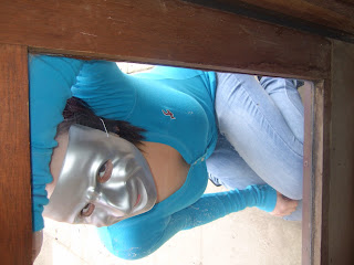
 In our media lesson Alana and I decided that we would go and take a few pictures of her in the mask to see whether we could get an idea as to what we liked and could sue for either our magazine cover or film poster.
 We took the photos in a variety of places most of which were either of Alana face on at the camera in a close up of her face in the mask which we though could look good as the front cover of the magazine, because it is so eye catching and would really intrigue the audience drawing them in. I think the mask also represents the genre because the mask is indeed scary, but it also gives some of the narrative of the film to the audience . The ones of Alana in a mid shot showing her body hunching down in crouching positions make her seem creepy and cunning, and the fact that she is peering through a window suggest the audience trying to make barriers between her and themselves, this again hints the genre and character that we are trying to portray.
Hopefully we will use these


No comments:
Post a Comment