Below we have made some screen grabs as to what we have manipulated in the each of the main shots. We are still quite a way from finishing our teaser trailer as we still have to add in music and inter-titles and smooth out the transition from one scene to the next.
 This is the opening shot of Milly being dragged through the woods by Alana the killer. We used the effect of 'old film' to give the effect of the event has already happened in the past, meaning that the shots are not following chronological order. The movement is also already grainy and blurry when moving, giving the impression of disorientation and panic. We also reversed the shot so instead of Milly being dragged backwards, she seems to be pulling herself forward in a awkward motion towards the camera making it eerie and chilling for the audience.
In this scene we have tried to replicate a night vision effect. We did this by the balance of the shots, we increased the green whilst decreasing on the red and blue, giving a greenish ting as on a night vision camera. We also made the contrast greater within the shot making the outline and a darker image especially around the features of my face so you can see my facial expression and when I react to Alana entering as the killer. We also put on a spotlight effect that attracts the audience's attention to my face and the facial expressions that I pull. This is also used on the same scene in Milly's shot where Alana as the killer is pinpointed to the audience by this effect where she would not be seen by the audience otherwise.


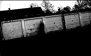
These top two shots are of the garage scenes where Alana is moving from place to place and you do not see her move only appear in each of the shots. The filming was done at early evening and so the already dark scene was quite eerie. However we thought we could perhaps enhance this mood by putting the scenes into black and white which I feel really captures the light on the mask, drawing the audience's attention to it and meaning that this becomes a large part of the trailer. The black and white also suggest the bleak outlook of the victims that are involved. I think that the background of this urban garage area really makes the film feel up to date and the background seems to make it all the more relate-able to the audience.
I think we are doing well with what we have at the moment but we are constantly changing and manipulating each shot. We are now very confident with using Adobe and this has come to our advantage, making the shots look effective and create emotion when audience's view the trailer.
No comments:
Post a Comment