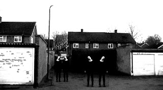
We have had some more poster ideas whereby we use the same image as before, but we have duplicated the shot of Alana and manipulated it by flipping it so it looks like there are more of her than there are, this again does still look disturbing and would draw in the attention of the audience.


In the idea above we duplicated this again and rotated it so there looks like there are four of Alana and she is standing in different places. I find it effective that her head is tilted in different directions in each shot that this makes it look rather psychologically disturbing and is what audiences really want to see. The only thing about this rough draft and idea is that the floor needs to be matched according to the shadowing.
We may indeed develop this idea further.
No comments:
Post a Comment