 Below I discovered how to edit around the part of the image that I wanted to remain. I did this by using a editing 'wand' that I would drag around the image of the tree, Alana and myself. I could then press the cut button and the background would be cut out leaving a blank background. I then decided that I wanted to fill the background with a new colour. On the right was a colour scale that allowed me to choose the colour that I wanted. I then selected the foreground option located along the top tool bar, then by selecting the paint can icon I could fill in the background.
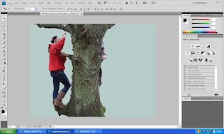
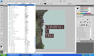
I then wanted to see if I could add text to what I had already created. By selecting the text icon on the left tool bar ( the large 'T' sign) I could pin point where I wanted the text to go. I then wrote what I wanted the text to say, realising it was to small, I located where the size of the text was situated along side the font type. Changing both of these made the text stand out and look bold against the image.
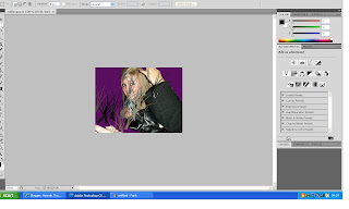
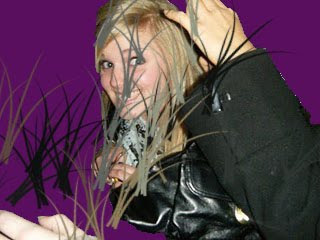
I then tried with a second Image I took one of the photos of Milly that we had used previously in my blog. I did the same as with the previous Image and cut around what I wanted to remain. I choose a different colour for this image and used a dark purple. Instead of putting text on this image I wanted to change the reality of it. I did this by adding in some images of grass blades that were already set on the software. I then put the grass where I wanted them, which was around Milly so she looked like she was hiding in the grass. I thought this looked very effective however I thought I had put to much grass around her and so wanted to take some out, but I could not seem to undo this tool.
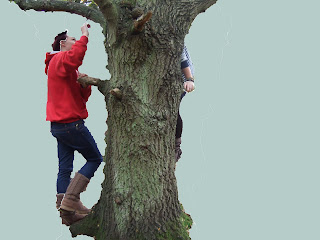
Below are the finished posters that I had created. I am pleased with the amount of experience that I had gained from just playing around with Adobe Photoshop and hopefully if we use this software I will be able to give advice on how to do it. I think the one thing that need to improve on is the quality of which I edit the background and around the image that I want to remain. As seen below particularly on the first poster the tree was very hard to cut out and I perhaps need to spend more time practicing.


No comments:
Post a Comment