 Here I have posted our final film poster.
 - We decided to use one of the photos that I had taken of Alana previously and then manipulated the image into black and white effect shown. I think this gives a great effect as seen above where a passer by would be induced to have a double look at the poster as they are not sure what the image is as the face seems to fade into the background. I feel this gives the impression of the character being illusive and eerie because you cannot see all the face but can recognize the mask.
- We decided to use the same font for the magazine cover and Film poster this I feel gives a sense of continuity throughout both of the texts. We used a sort of scratchy text that gives the impression of a horror genre.
- We have used a black, red and white colour scheme again the conventional horror colours. These colours give the impression of blood, darkness and also innocence seen through the white. These colours also help the the text stand out from the image behind it, highlighting the information that the poster is giving them.
- On the poster we have only given the vital information such as the: website for the film, the release date, the title of the film, the catch phrase 'don't cross the line' and also some remarks made by people who have viewed the film, really suggesting the genre and how scary the film really is.
- We have also centered the text around the image so the whole image seems to flow from one to the next.
I am really pleased with the poster I feel it is very different from others so it will stand out but has all the necessary elements to make it a scary horror film poster.


 I really like this second idea that I have come up with. It is in a more stylistic font which I think helps build continuity and recognizability such as the 'Empire' title. The bolder and lighter red colour again has the same connotations of blood perfect for the title but the colour makes it stand out even more to the audience. I have placed the review part at the end of the word and so it makes sense when you read it. I have rotated it to make the title seem a whole rather than two words and I feel this makes it look very professional. The bold outline really accentuates the boldness of the title. This would also be good for our poster cover as well.


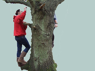
 Below I discovered how to edit around the part of the image that I wanted to remain. I did this by using a editing 'wand' that I would drag around the image of the tree, Alana and myself. I could then press the cut button and the background would be cut out leaving a blank background. I then decided that I wanted to fill the background with a new colour. On the right was a colour scale that allowed me to choose the colour that I wanted. I then selected the foreground option located along the top tool bar, then by selecting the paint can icon I could fill in the background.
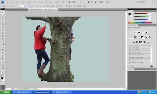


