Thursday, 7 April 2011

Evaluation Activity 4: How did you use new media technologies in the construction and research, planning and evaluation stages?

One way in which my group decided would be an appropriate way to look at all the media technology that we had used would be to take photos of us holding the equipment. We each took it in turns in photographing each other holding the equipment and then I have uploaded the photos onto my blog. We have also used some other forms of media which I have discussed below:

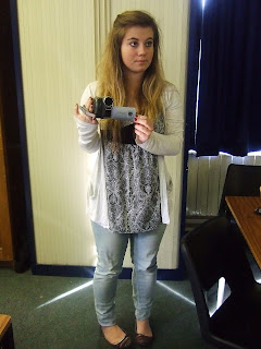
Above Laura has taken a photo of myself holding the camera that we used to film our teaser trailer. We used the camera to record the action within our teaser trialer, this included a variety of the shots, movements and angles displayed within our film. The cameras that we used proved to be very reliable and record much of the action in fairly high quality, although not in the quality that we would have hoped for with our teaser trailer. If we had used a more expensive camera I believe that we would have really been able to improve the quality of our work however the camera had limits that we worked with and were still able to produce a impressive amount of work form. The camera we used mainly for the picture and the microphone for the sound however on some of the camera movements were not a lot of dialogue was spoken or we did not want to amplify any particular sounds we used the camera's microphone. The microphone on the camera again was adequate enough to use, however there was a lot of humming coming from the camera that we had to edited out using music and our editing equipment the make sure that the humming did not detract from the picture.
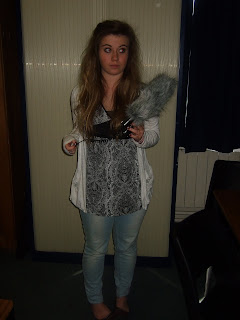
Here I have posted a photo of myself holding one of the microphones that we used in filming our teaser trailer. We used the mic. to pick up the sounds that we wanted to be heard clearly and that would appear on the teaser trailer while editing, this then gave us the option either amplify the sound or mute it. We decided in the end that we wanted to mute the entire trailer and only have our non-diegetic music playing.

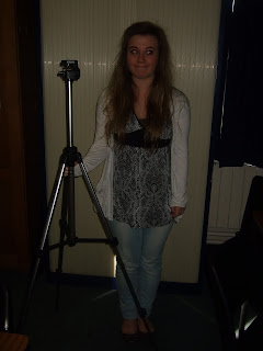
We used a tripod to steady our shots while filming. I think this helps us achieve a professional effect and a better viewing experience for our audience.


During editing we all three of our ancillary tasks (teaser trailer, movie poster and magazine front cover) we used the Adobe software this included Adobe Premiere Elements. On here we edited together our teaser trailer, this gave us the option to cut together scenes, take parts of footage out, put in effects, speed up/slow down footage, reverse footage and enter in inter-titles. We also used Adobe Photoshop and Illustrator to manipulate the images that we used on our magazine cover and poster.


I used slideshare as a way to upload my powerpoints that we had created things such as our first draft of our storyboard and also by means of researching other film magazines and so on. This was also a useful way to translate my powerpoints onto my blog.


Blogger was the main piece of media that I have used to create my coursework and record the progress that I have made throughout the year.

I have used windows paint to print screen images and upload them into paint, I have then been able to cut out parts of the image such as tables and pictures that I have found useful during my research and planning for our teaser trailer.


We also used youtube to find other teaser trailers and study them we also had to create an account and upload our own videos onto this such as our teaser trailer and preliminary tasks, which meant people we also able to comment on them.
All of these media texts have been able to help my group accomplish what we have and also have given us the ability to have free range over our creative choices and where we have got our inspiration from.
Evaluation Activity 3: What have you learned from your audience feedback?


As a group we had decided that we did not want to base our teaser trailer on just one other teaser trailer instead we wanted to take many features from other teaser trailers that we had enjoyed, found exciting and frightening and stood out to us, these then formed the inspiration for our own teaser trailer. Some aspects such as the mask was really original we felt and we had seen masks used successfully in other horror teaser trailers such as 'The strangers' and 'Triangle' which gave the strong image of killer and victim. We also found that within 'The Haunting of Connecticut' the non-diegetic music was truly terrifying with the eerie out of tune piano playing a high melody that continued throughout the trailer into the inter-titles, again we thought this was really effective in creating a tense mood in an audience and I think that we choose our music again an eeire piano to create the same intense atmosphere with our audience and we really pleased with the way the music fit to the images in the trailer. I also feel that the fast montage editing again really suggest the horror genre of our teaser trailer such as in the trailer 'The Blair Witch Project'.

I think that the strengths of our teaser trailer are:


  • The way in which the different effect that we have used on each of the shots really suggest the nature of the characters. The black and white effect is only ever used when the killer is within the shot, we felt that the black and white effect really exaggerated the features of the mask and made the mask feel like a really big USP of the whole trailer. I also feel that the 'old film' effect used over the scene when the victim is being dragged through the wood suggested the order of events and suggests to the audience that this particular event happened before some of the other events seen in the trailer. The night vision effect I also feel gives a great sense of reality to the scene making it more believable to the audience that it is in fact nigh time when this particular scene is playing even though we did not shot this scene in the dark. The spotlight shown within the night vision effect created an extra advantage by highlighting features with in the scene such as when the victims eyes move, sensing something is not right, or when the killer walks in behind the character in the fore ground, I feel that if it were not for this effect the audience would not notice these details.

  • I also feel that the way we edited the shots together was also a strength as the audience do not know much about the narration but understand the characters and their roles. The way by which the scenes are reversed and speed up again I think refresh the audience's mind in what they had just watched and I feel it shows great technical abilities. The overall impression given by this use of editing was 'If you could turn back time'.

I think the weaknesses of our teaser trailer are:


  • I feel that one of the things that we should have done better was the scene with the dog growling. Within the shot you can see hands, this could have worked well or poorly. We decided that the hands would belong to the killer in an attempt to quieten the dog, however some of the audience may not have thought this when they view the trailer and this can take away the effect of the scene and instead look like a poorly composed shot.

  • Another thing that I feel we could have made more progress in was quietening the background noise on the production company clip I feel that this interrupts the quiet piano playing, and can ruin the light 'eerie-ness' around the music.

Comments that we had recieved over social networking sites:


  • 'Its really good guys well done, just one thing is that the trailer doesnt really tell you anything about the film like any plot or anything its all very vague?'

  • 'I like the bit with the writing, where it looks like she is erasing it. I thought it was really effective as it could show the character is trying to erase her actions. I also liked the contrast between the Black and White colour scenes and the Coloured scenes.

  • 'good bits: ambiguous plot, makes people want to find out more editing is really quick by the end which makes it really exciting? idk its cool :) the reverse thing is really cool & memorable :) i liked the nightvision & how you can only just see the person in the background, tis creeeepy i liked the jumpy bit with the murderer (where they move really suddenly) maybe its a little too vaigue, but tis no biggie'

  • Overall this is a really good video. It's really well put together and I think that the quick editing works really well with the horror genre. The green night vision effect looks really creepy. Also the fact that you've made Hannah and Milly smile and act normal makes it seem even scarier, in the sense that it could happen to ANYONE. The music fits in really well and adds a really creepy effect to the whole video. The only negative comment I have is that I feel in places, the plot isn't clear


Overall I am pleased with what we were able to produce and that it is indeed an effective horror teaser trailer, I think that should we have had more time than we could have edited our teaser trailer further after hearing our audience feedback, correcting our weaknesses.

Evaluation Activity 2: How effective is the combination of your main product and ancillary texts?


We decided that within our group the best way that we could discuss this question was to record ourselves talking about it together. We decided that we would make a few bullet points as to what we thought we should discuss such as the mask appearing in all three of the texts that we had created and also the fonts and effects we had used and why. I feel this was a really good way in us developing each others points and giving our own opinions as to the strengths and weaknesses of our teaser trailer and ancillary tasks.

Overall I feel that we had successfully combined all three to look as if they were all working towards the same effect to attract our target audience and make them want to go and see the full film. The only thing that I would have liked to develop on would be the magazine cover in making the text stand out more from the background.

Monday, 4 April 2011

Evaluation Activity 1: In what way does your media product develop or change forms and conventions of real media products?

Within this post I will be looking at how conventional/un-conventional our teaser trailer is compared to a typical horror teaser trailer such as 'The Strangers' or 'Scream'.
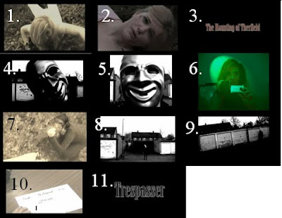
Shot 1.) The first shot that we choose was the one of our victims (Milly) being dragged through the woods by the killer (Alana). We filmed this scene using a camera, we used a low angle shot so we were close to the ground along where Milly was being dragged so you could see her facial expression but still not know who is dragging her, after we watched backed the raw footage. The footage was creepy to watch and the action of her being dragged through the woods and screaming was frightening, but we wished to exaggerate this feeling in the audience. On Adobe Premire Elements we decided to reverse the shot and so Milly seemed to be crawling towards the camera which really did look eerie. We then wanted push the scene more and so decided to use the 'old film' effect over the scene and so it gives the audience the impression of these events happening in the past, I feel this adds to the narrative of our teaser trailer. Another reason we chose this effect was because the scene is stripped of colour which really gives the clinical effect that we wanted. I also feel that this scene works as Milly is looking directly at the camera braking the fourth wall and connects the audience and the character, this not very common in horror teaser trailer and so I think this offers something different for our audience.

Shot 2.) We chose this shot to represent how we introduced our characters throughout the trailer. We only have three characters within trailer. The two main ones are our victim (Milly), our killer (Alana) and the best friend (me). The shot shown is of the victim we used a mid shot which allows the audience to see the characters in enough detail that they will recognize them in the actual film but not know all the details of their face leaving a still good amount of ambiguity around the characters.

Shot 3.) Here is an example of our font type that we used. We used a 'Minion Pro Black 89' font type this gave us a ghostly effect that really added to the atmosphere of the teaser trailer and the actual font that we used was called 'Birch STD' this gave the long and narrow characters that would give the haunting effect that we see so often in horror teaser trailers. We used our created style of text in all three of our media texts (magazine cover, poster and teaser trailer) giving the continuity throughout the texts that we needed to make them compliment each other and I feel it makes it look very professional.

Shot 4.) Compared to last year we did not need that many props or costumes. The main prop that we used as our USP (unique selling point) was the mask that the killer wears throughout the entire trailer. I think the important part of mask is that it hides the identity of the killer making them mysterious and adds to the 'eerie-ness' of the character. We tried to create the same effect as with the film 'The Strangers' as what makes the killers in that film so scary is that you can never see the emotions on the characters face and this is something that we wanted to do with our killer. We also used other props such as a knife (seen in shot 7), pajamas worn by Milly and I. These give the impression of real-life horror where it could be seen by the audience as a 'it could happen to you' scenario, where they can empathies with the victims.

Shot 5.) I have also included this shot because I think again it represents the importance of the mask.

Shot 6.) We chose the night vision scene to show how we had used special effects in our teaser trailer. We created our own as there was no night vision effect already on adobe premire elements. To do this we have enhanced the spectrum of the balance in the green area and decreased the blue and red light giving the green lighting effect. The darkening the contrast we created a darker light enhancing the impression of night time.

Shot 7.) We felt that this shot really summed up the genre that we were trying to convey to the audience. The knife coming down on the blonde victim held in the hand of a masked killer really does set the horror genre tone that we wanted for our teaser trailer and I think that we were really able to successfully do this with our teaser trailer and I feel we generally do create the moods of fear ans suspense within our audience when they watch the teaser trailer.

Shot 8.) This shot of the garages are one of the main locations for our teaser trailer. We chose the two settings of the urban garage scene where you would not expect a conventional horror film to take place in contrast with the conventional woods where the victim is typically isolated and helpless. Both settings mean that it appeals to both sides of the audience can some who are looking for the classic horror film and those who are looking for something that is a bit modern and urban, making it relate-able to them.

Shot 9.) Again shot 9 is another great example of settings and how they can create the effect and enhance the horror genre.

Shot 10.) This shot we felt helped set the narrative of the teaser trailer where I write the words 'we want to join' this adds to the complex storyline other than the straightforward killer kills victim. This adds another story involved which makes the audience want to know more and therefore want to watch the full film. We do not let on anymore than this which lets the audience interpret this in their own way.

Shot 11.) Here we took a screen grab of the title of our teaser trailer this appears from the second to last inter-title and the last piece of information that the audience have in their minds and so are able to go and look at it in more depth and remember it when they see it either on the poster or the magazine cover that we had created. Again we used the same font and style as for our inter-title keeping with the theme and making the whole trailer fit together.